Why Video Presentations Matter
Creating effective video presentations requires understanding that virtual audiences engage differently than in-person ones. What works face-to-face doesn't always translate online, where maintaining attention demands strategic planning in both design and delivery. By following these best practices, you'll deliver polished, engaging presentations that keep your audience focused throughout.
1
Craft a Compelling Title Slide
First impressions matter immensely. Just as we dress up for job interviews and brush our teeth before first dates, your title slide sets the tone for your entire presentation. It's your audience's first taste of what's to come and a critical indicator of quality. An exceptional cover slide gives your audience confidence that the rest of your presentation will be equally impressive. Conversely, a poorly designed title slide signals a lack of attention to detail and lowers expectations. Make it count—invest time in creating a visually striking, professional title slide that captures attention and builds anticipation.

2
Keep Slides Simple
Remember, slides are meant to support you—not steal the show. Your audience came to hear your message, not to decipher cluttered visuals. Avoid the temptation to fill every inch of space with logos, unnecessary graphics, or text boxes. Embrace white space and negative space; they're not wasted areas but breathing room that helps your key points stand out. Nothing on your slide should be superfluous. Each element must contribute to better understanding. Complicated, busy slides full of "chart junk" derail your message and distract from what truly matters: your story and your connection with the audience.

3
Use Quality Graphics
High-quality visuals elevate your presentation's professionalism. Use crisp, high-resolution photographs—whether your own, purchased stock images, or carefully selected online resources (always verify copyright permissions). Never stretch low-resolution images to fit your layout, as this degrades quality further. Avoid generic PowerPoint clip art and cartoonish graphics that audiences have seen countless times. While not all built-in art is bad, most of it undermines your credibility. If it came with the software, your audience has likely seen it before. Choose unique, professional imagery that enhances your message rather than detracts from it.

4
Choose Suitable and Large Fonts
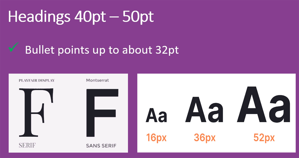
Fonts communicate subtle messages, so choose them deliberately. Use the same font family throughout your presentation—no more than two complementary fonts. For on-screen presentations, sans-serif fonts like Arial or Helvetica work best. While serif fonts are easier to read in print documents, their serifs often get lost on screens due to lower projector resolution. Avoid the overused Helvetica if possible and opt for modern alternatives. Consistency in font choice enhances readability and professionalism. Ensure your fonts are large enough to be easily read from a distance, maintaining a clean, modern look that complements your presentation's theme.

5
Produce High-Quality Audio
Audio quality can make or break your video presentation. Studies show that poor audio significantly reduces a video's impact and memorability. While achieving professional sound involves technical knowledge of sampling rates and compression, you don't need to be an audio engineer. The single most important investment is an external microphone. Built-in laptop or PC microphones often produce muffled, distorted sound that distracts your audience. A quality external microphone ensures your voice is crisp, clear, and professional. Additionally, record in a quiet environment, minimize background noise, and use basic audio editing tools to enhance the listening experience and keep your audience focused on your content.

6
Integrate Your Camera Feed
Showing your face creates connection and trust. When viewers can see your expressions and body language, your message gains depth and your delivery becomes more dynamic. This visual connection enhances credibility—audiences are more likely to pay attention and retain information when they can associate your voice with a real person. It mimics in-person communication, reducing the sense of detachment common in online presentations. Social presence plays a crucial role in maintaining interest. Even a small video overlay of yourself while presenting helps maintain engagement and makes the experience feel personal. Don't hide behind slides—let your audience see you.

7
Engage Your Audience
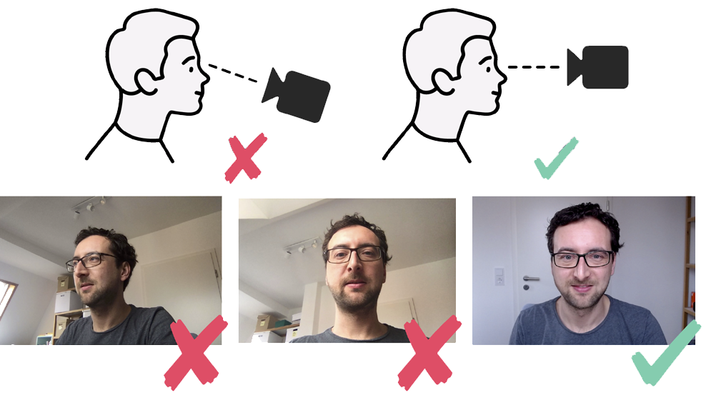
A common mistake in online presentations is failing to connect with your audience. When teaching software or demonstrating processes, many presenters only show their screen with voiceover narration. This creates a disconnect. Most of the time, you're not actively clicking or moving your mouse—you're explaining concepts and theory. If viewers only see your screen, the video becomes boring. However, when you look directly at the camera while speaking, you create a bond similar to face-to-face classroom interaction. This personal connection keeps learners engaged and interested. Incorporate yourself into the presentation through camera overlays and direct eye contact to maintain that vital human connection.

8
Get a Good Camera Angle
Camera angles influence how viewers perceive you. While a lower angle can create authority, it's generally unflattering and can exaggerate features. For the best results, position your webcam at eye level or slightly above to create a balanced, natural look. If you're self-conscious about your appearance, a slightly higher angle can be more flattering and help define your face. Avoid placing the camera too close, as it can appear intimidating. Aim for comfortable head-and-shoulders framing. While power dynamics can play a role, most professionals recommend an eye-level or slightly downward angle for a friendly, engaging, and professional presence on camera.

9
Apply Blurred or Virtual Background
Your background significantly impacts how professional and engaging your video appears. A cluttered or distracting background shifts attention away from you, while a clean setting enhances your presence. If tidying up isn't an option, blur your background or use a virtual one. A slight blur keeps focus on you while maintaining a natural look. Virtual backgrounds can establish your brand or set the right mood, but avoid overly artificial or busy designs that distract viewers. If using a virtual background, ensure proper lighting and contrast to avoid glitches or unnatural edges. The goal is creating a polished, distraction-free environment that keeps your audience focused on your message.

10
Practice and Test Before Broadcasting
A well-rehearsed presentation feels natural, confident, and engaging. Practice helps you refine your delivery, catch mistakes, and ensure smooth transitions between slides. Do several test runs aloud to get comfortable with your script and timing. This identifies areas needing improvement—unclear explanations, awkward pauses, or pacing issues. Record a short test video and watch it back to assess your performance objectively. Practicing reduces nervousness and allows you to focus on delivering your message effectively rather than worrying about what comes next. Additionally, rehearsing helps fine-tune your gestures, voice modulation, and overall presence, making your delivery more engaging and your final recording polished and professional.

Quick Reference Checklist
- Create an impressive, professional title slide that sets high expectations
- Keep slides simple with plenty of white space—less is more
- Use only high-quality, high-resolution graphics and images
- Choose clean, readable sans-serif fonts and use them consistently
- Invest in an external microphone for crystal-clear audio
- Show your face on camera to build trust and connection
- Look directly at the camera when speaking to engage viewers
- Position your camera at eye level or slightly above
- Use a clean, blurred, or appropriate virtual background
- Practice multiple times and record test videos before your final take
